Tag Designer#
The tag designer control can be selected using #tag_designer. Within the tag designer, there are several controls which can be styled.
Content#
| Title | Selector | Description | Type |
|---|---|---|---|
| Menu Wrapper Frame | #controls_frame |
Wrapper frame that surrounds the menu buttons at the top of the designer window. | QFrame |
| Add Field Button | #btn_add |
Allows the user to add a new field to the root of the tag class. | QPushButton |
| Tag Class Settings Button | #btn_tag_settings |
Allows the user to edit details about the tag class. | QPushButton |
| Save & Export Button | #btn_save_export |
Allows the user to save and export the tag class to various formats. | QPushButton |
| Field List Widget | #scrollArea |
Scroll area which contains the fields for the current tag class. | QScrollArea |
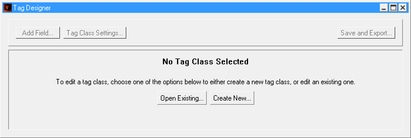
No Tag Class Notice#
When the tag designer is first opened, no fields are displayed - instead, a message is displayed instructing the user to open or create a tag class. The controls for this message are as follows:
| Title | Selector | Description | Type |
|---|---|---|---|
| Notice Title | #lbl_placeholder_title |
Title label informing the user that there is no tag class opened. | QLabel |
| Notice Info | #lbl_placeholder_info |
A label displaying a brief description on how to use the tag designer. | QLabel |
| Open Existing Tag Class Button | #btn_open_existing |
Used to edit an existing tag class. | QPushButton |
| Create New Tag Class Button | #btn_create_new |
Used to create a new tag class. | QPushButton |
Tag Fields#
When a tag class is being edited, each field displayed within the field list can be independently styled. Each of these fields are identical to the fields described in the Tag Editor styles reference, however most fields will have some additional controls that only display within the tag designer that can be styled.
Edit Fields#
Most tag fields will simply have a single edit field, displayed when editing a field's display name:
| Title | Selector | Description | Type |
|---|---|---|---|
| Field Title | #tb_designer_edit |
A text field that is used to edit the display name of a field. | QLineEdit |
However, some specific fields will have different or additional edit fields that are used instead:
| Title | Selector | Description | Type | Effective On |
|---|---|---|---|---|
| Field Title | #tb_designer_title_edit |
A text field that is used to edit the display name of a field. | QLineEdit | Comments, Tag Blocks, Colors, Tag References, Data References |
| Comment Explanation | #tb_designer_explanation_edit |
A text field that is used to edit the description of a comment field. | QLineEdit | Comments |
Drag Container#
Each tag field within the designer is wrapped within a Drag Container widget, which is used to provide drag-n-drop functionality as well as extra editing features. The controls for the drag container itself (not including the tag fields displayed within) are listed below:
| Title | Selector | Description | Type |
|---|---|---|---|
| Drag Container Root | #drag_container |
Parent/root widget of a drag container | QFrame |
| Drag Container Frame | #drag_container_frame |
Frame used to surround all drag container contents | QFrame |
| Content Frame | #content_frame |
Frame which surrounds the main content area of the container | QFrame |
| Content Layout | #layout_contents |
Layout which contains all child widgets within this container | QVBoxLayout |
| Control Frame | #control_frame |
Frame which surrounds the edit panel of the container | QFrame |
| Edit Button | #btn_edit |
Button which allows the user to edit certain properties of the container's widget | QPushButton |
| Field Type Dropdown | #cbox_field_type |
Dropdown which allows the user to change the type of the tag field displayed within the container | QComboBox |
| Field Icon | #gv_field_icon |
Icon used to indicate what type of field is being displayed | QGraphicsView |
| Grip Frame | #grab_frame |
Frame which surrounds the drag grip sidebar | QFrame |
| Drag Grip | #grip_frame |
Frame which is used to represent the drag grip - this is what the user clicks on to drag and drop the container | grip_frame (QFrame) |
Additionally, drag containers have several dynamic states which rely on certain resources. In order to change these styles, your theme must also override these resources. The full list of resource IDs used are listed below:
| Description | Resource ID | Resource Group | Default File Location |
|---|---|---|---|
| Applied when the user clicks on the drag grip, but has not started dragging the widget yet | text_css_drag_container_select |
shared |
{ENGINE_DIR}/content/editor/shared/text/drag_container_select.css |
| Applied to the user once they have started dragging the widget | text_css_drag_container_drag |
shared |
{ENGINE_DIR}/content/editor/shared/text/drag_container_drag.css |
| Applied to the widget when the drag container has been focused, and edit controls have been enabled | text_css_drag_container_focus |
shared |
{ENGINE_DIR}/content/editor/shared/text/drag_container_focus.css |
| Applied to the widget when it is unfocused, and edit controls are hidden | text_css_drag_container_unfocus |
shared |
{ENGINE_DIR}/content/editor/shared/text/drag_container_unfocus.css |
Drop Zone#
Drop Zone widgets are invisible widgets that are used to handle drag and drop. The list of selectors used within the drop zone are as follows:
| Title | Selector | Description | Type |
|---|---|---|---|
| Drop Zone Container | #drag_drop_zone |
The drop zone widget itself. | QFrame |
| Drop Zone Separator | #drop_active_separator |
The frame used to represent the separator. This is what should be made visible to the user when they are intending to drag and drop a widget into this drop zone. | QFrame |
Unlike most widgets, you must style them by overriding the appropriate resources. This is because the styles are changed depending on the state of the drop zone (whether it is active or not). The full list of resource IDs used by drop zones are listed below:
| Description | Resource ID | Resource Group | Default File Location |
|---|---|---|---|
| Active (Hovered) | text_css_drop_active_separator |
shared |
{ENGINE_DIR}/content/editor/shared/text/drop_active_separator.css |
| Inactive (Unhovered, Default State) | text_css_drop_active_separator_inactive |
shared |
{ENGINE_DIR}/content/editor/shared/text/drop_active_separator_inactive.css |